In my recent webinar, Library Signage: The Good, The Bad, and The Ugly, one of the most important (and often overlooked) topics we discussed was ADA compliance. It’s easy to think of signage as simply directional or informational—but in reality, it plays a critical role in accessibility, inclusion, and even legal compliance.
As a follow-up, I want to highlight two valuable resources that can help libraries better understand and evaluate their signage.
Understanding ADA Signage Requirements
The ADA signage guidelines from the U.S. Access Board provide a comprehensive look at what makes a sign accessible. At a basic level, ADA-compliant signs must be usable by individuals with low vision, blindness, or other disabilities.
Some key takeaways include:
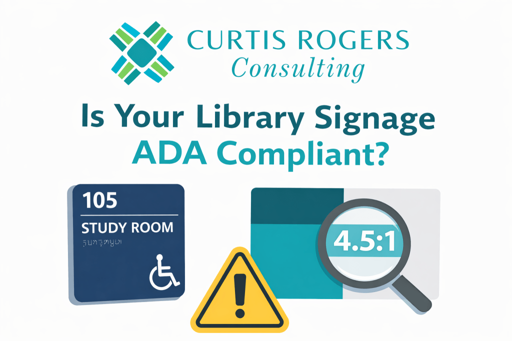
- Not all signs are treated equally. Permanent room identification signs (like restrooms, study rooms, or offices) must meet stricter requirements than temporary or informational signs.
- Tactile elements matter. Many signs—especially those at doorways—must include raised characters and Braille so they can be read by touch.
- Placement is critical. Tactile signs should be mounted at specific heights (generally 48–60 inches from the floor) and in consistent locations, typically on the latch side of doors.
- Typography and finish count. Fonts must be simple (sans serif), non-decorative, and paired with a non-glare finish and strong contrast between text and background.
One important nuance: a single sign can contain multiple types of information, and each type may have different compliance requirements. For example, a room number may require tactile features, while hours of operation may only need to meet visual standards.
Why Color Contrast Is So Important
The second resource, the WebAIM Contrast Checker, focuses on one of the most common accessibility issues I see in libraries: poor color contrast.
The tool allows you to test whether your text and background colors are readable for users with low vision. It’s simple to use—but incredibly powerful.
Here’s what you need to know:
- Contrast is measurable. Accessibility standards use a “contrast ratio” to determine readability.
- Minimum standards exist. WCAG guidelines require at least:
- 4.5:1 contrast for normal text
- 3:1 contrast for large text
- Many designs fail. Low-contrast signage (like light gray text on a white background) may look modern but can be unreadable for many users.
This is especially relevant for libraries that are trying to align signage with branding. A beautiful color palette doesn’t automatically translate into accessible signage.
What This Means for Libraries
In my experience, most libraries are not intentionally ignoring ADA compliance—it’s simply that signage evolves over time. Different departments create signs, temporary signage becomes permanent, and branding changes aren’t always reviewed through an accessibility lens.
The result? A mix of signage that may confuse, frustrate, or exclude users.
ADA-compliant signage is not just about avoiding legal issues—it’s about:
- Improving the user experience for everyone
- Supporting independent navigation
- Demonstrating your library’s commitment to inclusion
Need Help Evaluating Your Signage?
If you’re not sure where your library stands, you’re not alone.
I’ve conducted over 75 library signage and image audits in public and academic libraries across South Carolina, helping organizations identify issues and create clearer, more accessible, and more user-friendly environments.
If you’d like an objective, experienced perspective on your library’s signage, I’d be happy to help.
Feel free to reach out to learn more about library signage audits and library image assessments—and how small changes can make a big difference in how your users experience your space.
